


Spring is upon us! What an exciting time of the year. The weather is starting to improve, we feel lighter in our step and the anticipation of the summer months leaves us with a sense of adventure and a desire to step outside once again. There is so much for little ones to explore; tadpoles in ponds, blossoms on trees, daffodils, tulips and bunnies!
Whether it’s our upcoming mini sessions or your own custom session with BBP, we’ve got you covered with these 6 tips and examples for your spring wardrobe.
1- TEXTURE
Layers and texture add a wonderful amount of dimension to your photos! For example, layer your son with a t-shirt and a denim button down over it, your daughter with a belt that adds a pop of color, or mom with a flowey top for texture. It’s harder to layer in spring because we are so ready for cooler/summer clothing, but throwing a few layers in here and there provides just the right amount of texture to make your eyes flow from person to person. Think hats for the boys, a light airy scarf for the girls, leggings with a ruffled skirt, necklaces, etc.
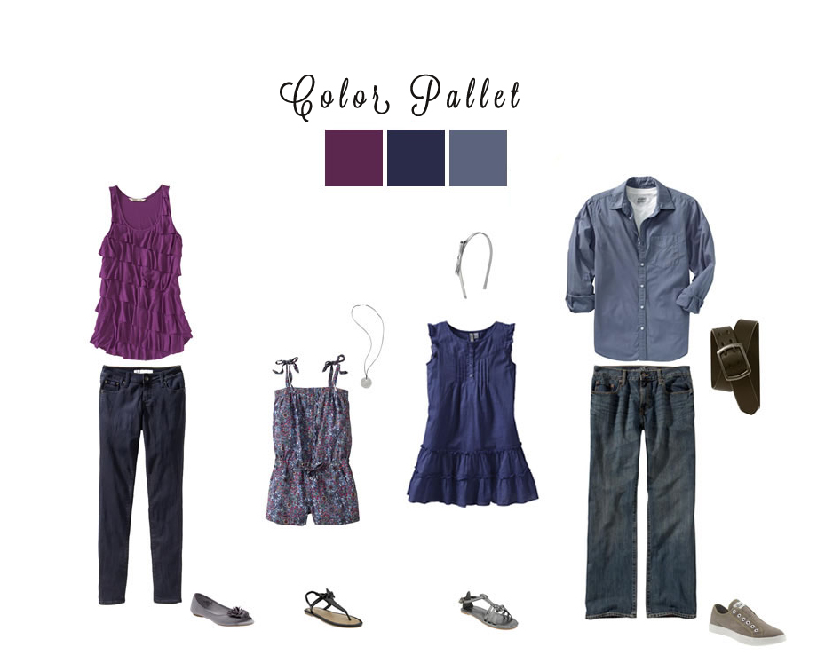
2- CHOOSE 2-3 COMPLIMENTARY COLORS THAT YOU LIKE.
It could be yellow, blue, and cream or red, brown, and white. Either way, make sure you’ve got some color in there. Then have one person, maybe two people, wear something that is a non-solid using the colors you’ve chosen. Everyone else should wear solids from the same color palette. This way you’ll look cohesive without being too uniform.
I strongly advise that you not mix too many non-solids together, especially if you have a small family. It will look too busy. For example, a family of 3 can have Mom & Baby wearing solids while dad wears a plaid shirt.
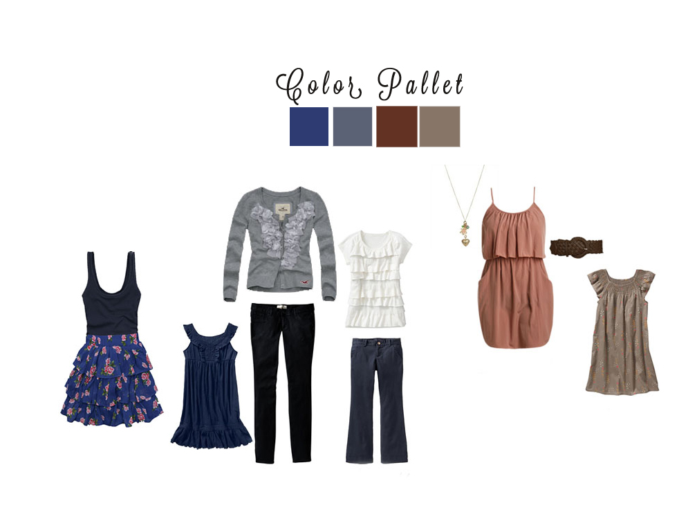
3- CHOOSE 2-3 COLORS FOR LARGE FAMILIES OR LARGE GROUPS
Then have everyone dress themselves using those colors. Its a win win because you’ll all match, but everyone gets to be themselves!
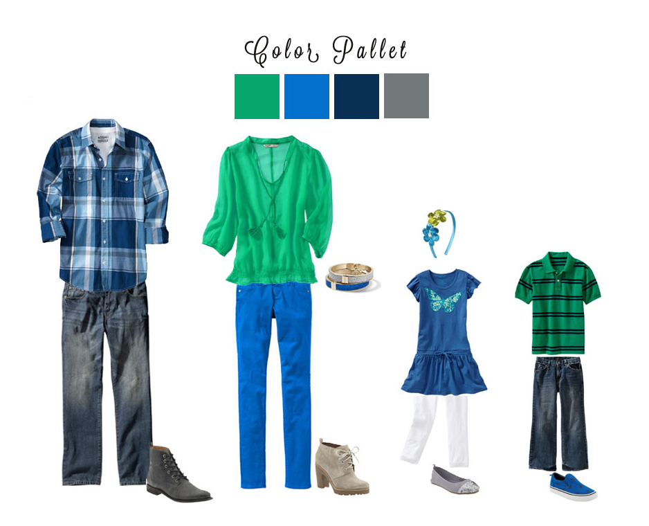
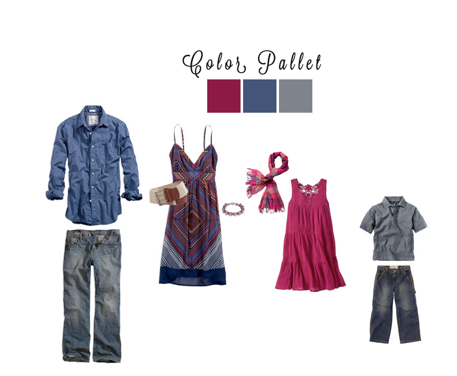
4- AVOID MATCHY- MATCHY.
Don’t feel like you have to simply choose one color to coordinate. I adore matching, but it’s fun to do something outside of the ordinary. Choose 3-4 even and spread out the colors through your individual clothing options. Grey pants for Dad, silver scarf for Mom, and a silver sweater for their daughter mixed with a plaid or jean print would pull together everyone in a cohesive theme, without reverting to the old “matchy-matchy”.
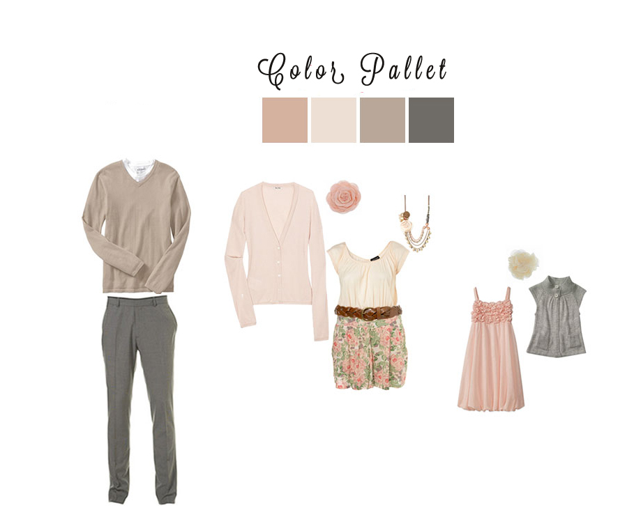
5- PICK NEUTRAL COLORS THEN ADD A SPLASH OF COLOR!
I love warm and neutral tones with a touch of color. Peach or light yellow is the perfect color for spring. Layering is a great way to add some versatility to your look. This combo below is my absolute favorite! So classy
6- LASTLY & MOST IMPORTANTLY, WHAT LOOKS GOOD IN YOUR HOME?
I’m going to say this first… Order prints! These images are artwork and the very best kind! Your family is your most prized piece of artwork. Think about what will look good hanging up on your walls. Pick clothing that will compliment the colors in your home so that you can display your photos proudly!


comments
LEAVE A COMMENT
0